Indiana Jones and the Lesson of New Perspectives
An experiment by director Steven Soderbergh provides a useful learning tool for storytellers in multiple mediums (as well as an exciting new way to enjoy 'Raiders of the Lost Ark')
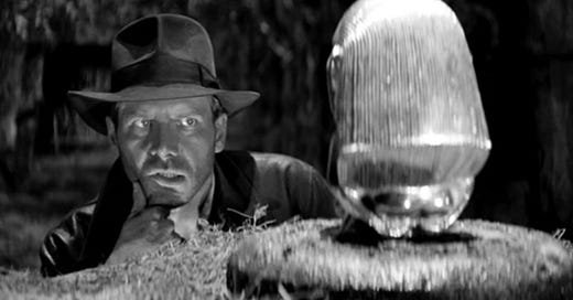
Director Steven Soderbergh has a blog, EXT765, where he occasionally shares his thoughts on art, and I recommend you subscribe to it if you’re a cinephile. Back in 2014, he shared a rather audacious experiment of his in which he took Raiders of the Lost Ark, arguably the greatest action film ever made, and desaturated it into a black & white film. He then stripped all sound out, including John Williams’s score, and, to entirely mess with your head, added in Trent Reznor’s scores from The Social Network and The Girl with the Dragon Tattoo. His intention was to draw attention to Steven Spielberg and cinematographer Douglas Slocombe’s staging of every shot, Michael Kahn’s editing, and the movement these two things create onscreen. In other words, to provide a new perspective from which to look at Spielberg’s classic. The result is, amongst other things, an amazing learning opportunity.
Here, I’ll let Soderbergh explain what he was up to himself (and at the end of this article, I’ll also share the link to the original blog where you can actually watch Soderbergh’s B&W silent version of Raiders)…
I’m assuming the phrase “staging” came out of the theatre world, but it’s equally at home (and useful) in the movie world, since the term (roughly defined) refers to how all the various elements of a given scene or piece are aligned, arranged, and coordinated. In movies the role of editing adds something unique: the opportunity to extend and/or expand a visual (or narrative) idea to the limits of one’s imagination—a crazy idea that works today is tomorrow’s normal.
I value the ability to stage something well because when it’s done well its pleasures are huge, and most people don’t do it well, which indicates it must not be easy to master (it’s frightening how many opportunities there are to do something wrong in a sequence or a group of scenes. Minefields EVERYWHERE. Fincher said it: there’s potentially a hundred different ways to shoot something but at the end of the day there’s really only two, and one of them is wrong). Of course understanding story, character, and performance are crucial to directing well, but I operate under the theory a movie should work with the sound off, and under that theory, staging becomes paramount (the adjective, not the studio. although their logo DOES appear on the front of this…).
So I want you to watch this movie and think only about staging, how the shots are built and laid out, what the rules of movement are, what the cutting patterns are. See if you can reproduce the thought process that resulted in these choices by asking yourself: why was each shot—whether short or long—held for that exact length of time and placed in that order? Sounds like fun, right? It actually is. To me. Oh, and I’ve removed all sound and color from the film, apart from a score designed to aid you in your quest to just study the visual staging aspect. Wait, WHAT? HOW COULD YOU DO THIS? Well, I’m not saying I’m like, ALLOWED to do this, I’m just saying this is what I do when I try to learn about staging, and this filmmaker forgot more about staging by the time he made his first feature than I know to this day (for example, no matter how fast the cuts come, you always know exactly where you are—that’s high level visual math shit).
Okay, I’m back. Now, it might seem to many of you that this experiment is only relevant to directors, editors, and cinematographers. Not true. This lesson in “changing your perspective” should offer a lot to screenwriters and comic book illustrators, in particular.
Screenwriting requires an economy of language, but this is especially true of action screenwriting. Your brain doesn’t require ten seconds to understand a few exciting beats onscreen; you shouldn’t expect a reader to need that long either if you want to convey some sense of movement, of thrilling action, of speed. So, here’s a challenge for you. Watch, say, the opening sequence of this B&W Raiders. Mutter aloud a line of action for each beat of it, imagining you’re writing a silent film. For example, here’s a simple one I came up with on the fly doing what I’m suggesting you try:
Indiana runs, just staying ahead of the small darts shooting out of the walls at him.
Here’s another description I came up with as I watched the same action sequence:
Indiana runs frantically, tripping, scrabbling, trying to stay on his feet as the boulder behind him gets closer…closer…CLOSER!
But I believe writing is rewriting, and my initial description is too longwinded for my taste. Remember, economy of language. Here’s a second draft of it:
Indiana runs frantically, trying to stay on his feet as the boulder gets closer…closer…CLOSER!
Or better yet:
Indiana runs frantically as the boulder gets closer…closer…CLOSER!
Want to get fancy with your page layout, try something like this, bumping the word “closer” onto separate lines to really create a sense of rapid-fire action:
Indiana runs frantically as the boulder gets closer
closer
CLOSER!
As for what Soderbergh’s experiment could provide aspiring comic book illustrators (and some professionals I’ve worked with): I would suggest a roadmap on how to convey visual movement. Studying strong action editing in cinema is a wonderful way to better understand how to lead a reader’s eyes across your page.
Anyway, there you go. I hope any of this is helpful to you, but, frankly, the most important thing you can take away from this article is access to Soderbergh’s B&W version of Raiders of the Lost Ark - which you can find here. It’s just a joy to watch, especially since it allows you to better focus on Slocombe’s exquisite cinematography, which might actually look better this way.
If this article added anything to your life but you’re not up for a paid subscription, please consider buying me a “coffee” so I can keep as much of this newsletter free as possible for the dreamers who couldn’t afford it otherwise.



I just started watching Soderbergh's "version." I'm loving this. But, hey, for the first time after viewing this film umpteen times, I caught a funny continuity error. Go to 39:24 and look at how the guy is holding the knife: the edge is face down. And then a second later, in a shot from Marion's perspective, we see the edge facing up. Oh well. Nobody's perfect. Sorry, Steven, for ruining your day all these decades later. But watching this in black and white is nevertheless fantastic.
Sure, Cole. Just adding to what you're saying. Storyboard is such a behind-the-scenes activity. Most moviegoers are probably not very aware of it.